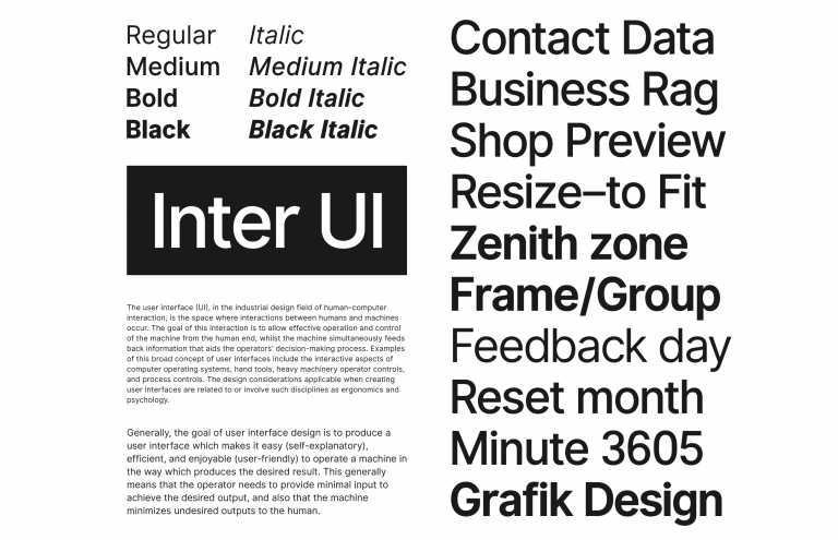
Inter UI is a free font family specially designed for user interfaces with a focus on the high legibility of small-to-medium sized text on computer screens.
The family features a tall x-height to aid in readability of mixed-case and lower-case text. Several OpenType features are provided as well, like contextual alternates that adjusts punctuation depending on the shape of surrounding glyphs, slashed zero for when you need to disambiguate “0” from “o”, tabular numbers, etc.
Using the font is as easy as download & installing locally on your computer.
You’re free to bundle copies of Inter UI with your software, even if it’s commercial and you charge money for your software. Inter UI can also be used on the web by either hosting the font files yourself or by including this CSS:
@import url('https://rsms.me/inter/inter-ui.css');
Use the following CSS rules to specify the Inter UI family:
font-family: 'Inter UI', sans-serif;
The story behind Inter UI
Inter UI started out in late 2016 as an experiment to build a perfectly pixel-fitting font at a specific small size (11px.) The idea was that by crafting a font in a particular way, with a particular coordinate system (Units Per EM), and for a particular target rasterization size (11), it would be possible to get the best of both sharpness and readability.
However after a few months of using an early version of Inter UI, it dawned on everyone exposed to the test that this approach had some serious real-world problems. Most notably that it was really hard to read longer text. Because of the pixel-aligning nature of that approach, the font took an almost mono-spaced appearance, making it really easy to read numbers, punctuation and very short words, but eye-straining to read anything longer.
The project was rebooted with a different approach, sticking with the specific UPM, but crafting glyphs and kerning in a way that made for more variation in the rhythm and smoother vertical and horizontal stems. As Inter UI was being developed, it was tested on an internal version of Figma—where the author of Inter UI works as a designer—and slowly improved upon based on experience and feedback.